Trevor
Staff  DC Comics Fan
Posts: 762
|
Post by Trevor on Feb 26, 2008 21:08:17 GMT -5
|
|
|
|
Post by HoM on Feb 27, 2008 13:56:44 GMT -5
Where's that robot from... Damn, reminds me of something and I can't place my finger on it...
|
|
|
|
Post by Lantern Lad on Feb 27, 2008 14:09:35 GMT -5
Looks good!
I like the name Tess Lacoil. Funny!
|
|
|
|
Post by lissilambe on Feb 27, 2008 14:24:37 GMT -5
Very cool stuff indeed. And yes, Tess Lacoil is an awesome name. And some interesting design work. Very imaginative.
Take care
Don
|
|
tigereyes
Staff
I loves me some super villians...
Posts: 282
|
Post by tigereyes on Feb 27, 2008 23:16:45 GMT -5
The robot looks a little like a design from the roleplaying game Rifts, if that is what you were thinking about Charlie.
This is some pretty cool stuff, deathstroke. It kind of gives me that 80's indie-superhero vibe, ala The Elementals or DNAgents, which were books I loved. Keep it up.
|
|
Trevor
Staff
DC Comics Fan
Posts: 762
|
Post by Trevor on Feb 28, 2008 19:51:24 GMT -5
Well being 37 years old, my style probably is very retro 80's, as that is where I did most of my learning. heh heh.
|
|
tigereyes
Staff
I loves me some super villians...
Posts: 282
|
Post by tigereyes on Feb 28, 2008 21:50:53 GMT -5
Yeah, I grew up on that stuff too. (I still pull out those books to check em out). These kids today don't know what they are missing  |
|
|
|
Post by Lantern Lad on Feb 28, 2008 22:40:25 GMT -5
Here here brother-in-age!
|
|
Trevor
Staff
DC Comics Fan
Posts: 762
|
Post by Trevor on Mar 6, 2008 18:20:42 GMT -5
Here is my Banner submission for Marvel2. I thought I would post it here for those who do not visit there. I hope you like. I also threw my name in the hat for drawing a new mini series coming up for DC2. Hopefully I get it!!!  |
|
|
|
Post by zirron on Mar 6, 2008 19:21:28 GMT -5
I got to see this in the prelim stages.. Now it's awesome |
|
Mischief
Staff
I Sit Upon My Throne As The Guardian & The Keeper Of The Lightning.
Posts: 1,517
|
Post by Mischief on Mar 24, 2008 14:02:17 GMT -5
I absolutely love that ShadowJak character.
Exalt for all the awesome artwork.
Mischief
|
|
Trevor
Staff
DC Comics Fan
Posts: 762
|
Post by Trevor on Apr 6, 2008 13:08:59 GMT -5
I was sketching this morning, practicing some new techniques (mostly rendering blonde hair, heh heh), and was also practicing drawing bigger, and spending more time rendering the picture to get used to drawing on 11x17" paper vs the 8.5x11" paper I am used to drawing on. I definitely can get a much cleaner drawing drawing bigger, and I believe it will be evident in drawings I will be submitting soon to this site. Here is an example of two phases of the drawing I was sketching. They are rendered with HB pencil (I normally use 2H - less smudging because it is a harder lead but you wouldn't be able to see it when I scanned it, heh heh) and the face is almost a full 8.5x11" page in size. I hope you will see what I am talking about when I say the lines are crisper, the detail is much more believable (to me anyway) and I will be able to do more with the covers because of this... The first was drawing the facial features, and getting proportions correct. Here is the first phase of the drawing:  Obviously these are just a generic rendering of a female's eyes, nose, and mouth, and could be absolutely anyone. Rendering the hair turns it into an actual person, giving it some life or making it resemble someone. If I gave it a hairstyle like supergirl, superwoman, or Power Girl, it would suddenly start to look like one of them especially if they had a trademark hair style. All I would do is throw down their symbol or logo, or their trademark, and it would be believably one of those characters. Here is the rendered picture with hair:  I could easily take this picture now and add a superwoman logo or draw a full length picture of power girl much smaller right beside the head in her full costume, and you would think this is the closeup of the face of the hero. I am feeling much better with my artwork when I am drawing bigger (with my latest sketches), and spending more time rendering, instead of rushing pictures, and submitting them. I am getting some feeling of accomplishment for some reason... So in the future, you will see much more detail in my drawings, tho they will take 2-3x longer to pump out. I always found when drawing on smaller paper, my pencil would smudge when trying to get smaller details, and when inking it would turn into a disaster for me. All the pictures I've submitted to Marvel2 and DC2 have been rush jobs on smaller paper. I was impatient when rendering and a little frustrated because of the size and the smudging problems when I was drawing them. Then I would ink them, and my inking was horribly done. I am pretty much done with inking digitally. I will be inking by hand using india ink, brushes and crow-quill pens. I spent the last couple of months trying, but it just isn't working for me. Inking is supposed to be enhancing the drawings, andmy digital inking is making the drawings worse. I am confident I can make them look much better inking by hand, so I will be doing that in the future with my covers. My skill comes from my hands, pen/pencil pressure, etc so hopefully I will be able to do better inking in the future... Sorry for babbling in a drawing thread, heh heh. I dropped a few covers so I could not only practice some new techniques, but to also be able to pump out a better quality product for everyone in the future. Starting with Catwoman #3, and possibly Detective Comics #30, and What If? #2 (over at Marvel2) you will most likey see a tremendous difference...♦ |
|
|
|
Post by >>Riz! on Apr 6, 2008 14:04:06 GMT -5
cool. looking forward to the new covers |
|
Trevor
Staff
DC Comics Fan
Posts: 762
|
Post by Trevor on Apr 13, 2008 2:14:14 GMT -5
Just a little doodle I thought I would post. Did this one while watching the Hockey game...  |
|
Trevor
Staff
DC Comics Fan
Posts: 762
|
Post by Trevor on Apr 16, 2008 23:12:03 GMT -5
I am currently drawing a submission for an art contest. The objective of the contest is to create a superhero or villain, provide a background, and stats, and also to draw it. They will be judged based on Artwork, creativity of the hero or villain. THe winner of the contest wins a BATMAN STATUETTE!!! Wooot! I'm working on a villain right now. I would like your HONEST opinion as to how it looks so far. Please do not worry about hurting my feelings (because they won't get hurt). I am spending a LOT of time on it currently, so far the pencils that I am about to show you have taken me around 5 hours. This picture represents only a fraction of the whole composition (1/4 of a page). I've zoomed in on it so you can see the details better. I am going to have a lot more stuff for the background as well as to the left of her when it is done. This drawing should take me around 15-20 hours total to finish penciling. Then I will be inking and coloring it. Could you please give me your HONEST opinion as to how this drawing looks so far considering it is going into an international competition? If you see something glaringly wrong with it can you let me know?Comments would be greatly appreciated. Again, you won't hurt my feelings. Here is the part that I've done so far. I still have to draw her boots, and arms and hands (I haven't done them yet, because I need to render some objects around, over and in them). They will come soon.  |
|
|
|
Post by brigante133 on Apr 17, 2008 0:00:41 GMT -5
Umm, if you are looking for someone to nitpick, I can certainly do that for you. One thing I would look at is the breasts, especially if you want to highlight the cleavage as you have done so far. They are spread a bit too far apart, it's nothing that shockingly obvious but for comic book art, it is a bit awkward to have that big of space. What I would do, is push the outer contours of them closer to her body and it would squeeze it up a bit and look less... open? The costume is a bit puzzling too because some parts are tight against her body but are pointy upwards but that is purely a tick I have with designs like Emma Frost's which are passable so if you dig it, go for it. The biggest thing that I think stands out is that the tips of the wings can work as the outline of the breasts or the armpit on the left side but it's the outline of the breast on the right side so it looks really flat on the left. The right shoulder (her left) is a bit high up, if you adjust the curve a tad lower and make the shoulder jut out more i think it might look a little better. The neck muscle on that side is just WAY shorter then the other so its not symmetrical and since it's not receding or retracting, there shouldn't be any foreshortening. Also on our right side, her forearm is a bit short for the rest of the arm, possibly on both sides but I'm not sure since the hand is not drawn. I drew on that what I think the other arm should be like which is hanging at her side. As it is it looks unnatural because no one really stands like that. I noticed that the pelvis was a tad large, it's almost the size of the rib cage which is in proportion. That'd be really easily fixed by raising the crotch a little bit. I put this together in a couple seconds to let you know what I mean. 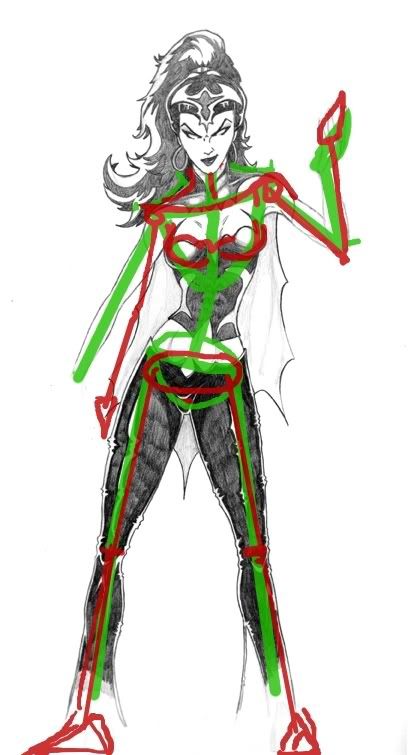 I really don't hope you take offense to this, I am just showing you what I can see in it from an impartial eye, I know when you work on something for a long time and you put a lot of effort into it you get too intimate with one section and it's not always right. I honestly would not go through the trouble of pointing all this out if i didn't think it was well drawn to begin with but I figured you asked for an honest critique so that's it. Let me know if any of it was helpful. |
|
Trevor
Staff
DC Comics Fan
Posts: 762
|
Post by Trevor on Apr 17, 2008 1:01:05 GMT -5
WOW thanks for the great critique! Dawg, this is going into an international competition, believe me I appreciate all your comments, as I do not want to be embarrassed when I submit this. I am hoping you can take a look at my changes below to see if I pulled off what you were trying to describe. A few comments back: 1) Breasts - Made the change below and balanced the breasts. P.S. I LIKE PASTIES... 2) Left Shoulder - Good call! I noticed that it looked a little high too, but I was looking for a more angled pose (more dramatic movement). Now that you've pointed it out, the shoulder does look a bit thick so I lowered it and corrected it. See below. 3) Pelvis - Hmmm. I don't know about this one. There are all different sizes of pelvis and I love a good child bearing woman... heh heh. I decided not to change this one. Hopefully it doesn't look weird to leave it like that. I don't visually notice it being crazy out of proportion or anything. 4) Right forearm - This arm was not done, and I planned to change the position as I got to it, because I want her holding a rat in each hand!!! Let me know if the position of the arm looks more appealing, and if not, a suggestion would be great. I will fix proportion once I get to drawing the arm (it looks out of proportion to me currently). Here are the changes. Please let me know if the changes look ok. Thanks again, I appreciate the critique. It is the only way to improve it. I am hoping that I will not embarrass myself in the competition with this piece, as there will be some pro to semi-pro artists there submitting as well. Hopefully I don't look like a noob. Here are the changes:  |
|
|
|
Post by brigante133 on Apr 17, 2008 1:17:29 GMT -5
Very nice! I still think the tip of those wings makes it look like the breasts are growing out like that so adding another curve at the edge of them would really help. It's your call on the elongated sacrum, I think you are right though, looking back at it, i don't really notice it at all. If you plan on placing that belly button it would probably prove me wrong all together. ha The reason the arm going up is a bad call is that because you have these two angles that lean inward to one side, it is suggesting that she is putting the wieght from her upper body on one side, in thhis case the left so either she has her arm hanging down or she has something significantly heavier in that hand that would cause her shoulder to slump to the side. It's a good way to make the body look dynamic but you have to have some logic behind it or it looks kinda funny. Actually i messed up on this one and my arm on that side (the one hanging down) is too short but I think you get what I'm saying. I would just avoid both arms sticking up, though. Just noticed that your neck looks a bit thick there. It's nearly as wide as her head sans the hair, even adding a little shadow to reduce it will go a looong way. I noticed now the arm on the right side looks really thin, maybe its intentional but it just feels too small. 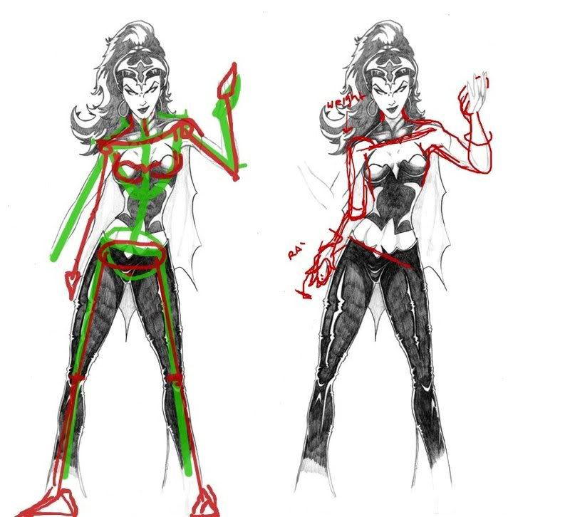 |
|
Trevor
Staff
DC Comics Fan
Posts: 762
|
Post by Trevor on Apr 17, 2008 1:34:13 GMT -5
I will add a little more meat to the arm tomorrow. I think it could use a little more as well especially in the bicep area. Now know what you are talking about with the breasts. I quickly drew lines on the side of each breast, and it really made a difference in how it looked. I also like your idea with the arm position. If I turned it palm up with the angle you drew, and stick a rat in there, do you think it would look better? Or do you think the palm down looks more unique and cooler? Thinking about it I really like the palm down, it is an unexpected hand pose holding a living animal. By the way, thank you so much for your critique, you have made some very good observations. It is so hard to see this stuff in your own work... Unless you sit back 10 feet and stare at it for 30 mins... lol. You are so biased when you draw it... heh heh. I will post more updates throughout the week. I hope you keep an eye out and have time to comment more, your observations are invaluable to me. I wouldn't normally be this anal with my work, but for a competition, I think when you put your best foot forward, you can't go wrong. Do you think the quality of the pencils so far is competition worthy? Or am I dreaming too big? |
|
|
|
Post by brigante133 on Apr 17, 2008 1:39:56 GMT -5
Anytime, yo. A couple people here at DC2 and I have had some pretty fun chats overcriticizing each others work but we are better for it. What sucks is that I know what's wrong in my drawing but usually am not able to make it better, ha.
I always say those who cannot do sometimes have good opinions for those who are trying. Okay, I've never said it and it doesn't sound very good but whatever. Palm up would work too, the bone in the forearm that allows you to twist your wrist (can't believe I don't remember the name...) is nifty like that and both ways work out.
|
|
|
|
Post by brigante133 on Apr 17, 2008 1:40:42 GMT -5
ARGH, radius is the name of it.
|
|
|
|
Post by David on Apr 17, 2008 6:10:21 GMT -5
Man, I was just gonna say she needed suspenders to keep her London Bridge from falling down...
But what Ramon said, too!
Nice pic, Trev. Good luck!
(Hmmm. Can't get this sort of exposure or support at the Marvel2...)
|
|
Trevor
Staff
DC Comics Fan
Posts: 762
|
Post by Trevor on Apr 17, 2008 8:31:23 GMT -5
(Hmmm. Can't get this sort of exposure or support at the Marvel2...) Heh heh. I posted at DC3, DC2 and Marvel2 (cause not everyone goes to all 3 sites). We will see which site offers the most help... Which one do you think it will be?  |
|
|
|
Post by David on Apr 17, 2008 8:35:00 GMT -5
(Hmmm. Can't get this sort of exposure or support at the Marvel2...) Heh heh. I posted at DC3, DC2 and Marvel2 (cause not everyone goes to all 3 sites). We will see which site offers the most help... Which one do you think it will be? ;D |
|
Trevor
Staff
DC Comics Fan
Posts: 762
|
Post by Trevor on Apr 17, 2008 23:13:00 GMT -5
Okay here is an update. Comments welcome...  |
|
|
|
Post by Alex on Apr 17, 2008 23:40:15 GMT -5
looks real good man
|
|
|
|
Post by HoM on Apr 18, 2008 11:47:08 GMT -5
Ramon's critique was honest and well worth the read (Not only on your art Trevor, but loads of artists can take to heart what he's said!) even though I'm not even an artist!
Though her breasts still look a bit off to me... But that could just be my opinion.
|
|
Trevor
Staff
DC Comics Fan
Posts: 762
|
Post by Trevor on Apr 18, 2008 18:48:18 GMT -5
Do you think her face is too plain? Should I Goth out the make-up a bit?
|
|
Mischief
Staff
I Sit Upon My Throne As The Guardian & The Keeper Of The Lightning.
Posts: 1,517
|
Post by Mischief on Apr 18, 2008 19:04:06 GMT -5
Though her breasts still look a bit off to me... But that could just be my opinion. The breast look fine to me and if its one thing I know...its women's breasts. Her breasts can look like the those on my beauties. Mischief |
|
|
|
Post by David on Apr 18, 2008 19:05:40 GMT -5
Though her breasts still look a bit off to me... But that could just be my opinion. The breast look fine to me and if its one thing I know...its women's breasts. Her breasts can look like the those on my beauties. Mischief That was almost Shakespearean, Chief... |
|